Three hours is no time at all to do justice to an RHS flower show, yet that was all the time I had available this week as I arrived at Hampton Court. Three hours to lose myself in the delights of the Floral Marquee, to visit, photograph and ponder each of the show gardens and to try to avoid my habitual Hampton Court behaviour of getting lost and missing out an entire section. A fool’s errand, and none better qualified to attempt it than I.
The first casualty of my ridiculous schedule was the Floral Marquee, where I could happily have spent the entire day. As it was, I barely managed a couple of laps – having time to congratulate the very splendid
Fibrex Nurseries for another double gold medal for their fabulous ferns and pelargoniums, all of which I wanted to buy, and many of which I’m sure I shall. There’s a mixture of fear and
excitement when you find people who make a living out of tending, nurturing and selling the things which you crave. Enablers.
 |
| Pelargonium sidoides, stunning, delicate, one of my absolute favourites |
 |
| Just one of the ferns on my wishlist at Fibrex Nurseries |
I was also lured by the stand of
Trecanna Nursery from Cornwall, who specialise in hardier South African plants – I do love my crocosmias, and they have them aplenty.
 |
| The photo really doesn’t do justice to these burnt orange shades |
Sadly, a decision had to be made – spend the rest of my allotted time dribbling over other people’s plants, or get out and see the gardens. With something of a wrench, I dragged myself outside to pound the walkways which criss-cross the grounds, propelling myself from the tent into a cacophony of clattering plant trolleys under a brooding sky.
Firstly, just to get them out the way, some of the less successful aspects. I really don’t like to linger on the bad points but there were a few, and blimey, there were some rough edges this year, notably a yew hedge which couldn’t decide if it wanted to be formal or unkempt, and a mass of
Stipa tenuisima which had a bad case of bed hair – obviously,
Stipa ten can do this, but if you’re going to use it as a key plant, it helps to get it right. Both of these mishaps were in the Your Garden, Your Budget section – formerly the Low Budget, High Impact gardens – but this area also hosted several of my favourite gardens, of which more later.
‘Plastic’ planting – a personal bugbear of mine – was also in evidence in places here as it was in Chelsea. I think it’s excusable on the equipment and furniture stands, although to be fair much of the planting around these is done with pleasing subtlety and complexity. I’ve been trying to identify just what it is that makes me look at a show garden and think, “Hmm. Plastic”. They all have in common a slightly sterile quality – too-perfect foliage – hedges of box and other evergreens with thick, waxy leaf cuticles, plants that look like they’ve just been popped into the ground rather than grown there, earth closing cleanly around the stems with nary a sign of disruption. Of course the plants
have just been popped into the ground, but unless you’re creating a bedding scheme – which has its own rules – there’s an illusion that needs to be maintained with a show garden, and some artful scuffing up in places can go a long way.
 |
| Planted, or plonked? |
I realise that in the same breath I’m complaining about the presence of rough edges as well as the lack of them, but it’s all about the context; in one situation it can suggest a slapdash approach, in other it indicates a certain finesse and accomplishment. I think another common factor with this style concerns the use of colour – planting is often in blocks of the same shade, rather like bedding planting, but with a different selection of plants – cottage garden bulbs and perennials rather than begonias and marigolds. So, rather than a Gertrude Jekyll effect, the impression is vaguely modernist, but with all the straight lines blurred – like a Mondrian left out in the rain. This isn’t a bad thing – it didn’t stop Luciano Giubbilei’s garden winning Best in Show at Chelsea this year – it’s just something I don’t find particularly pleasing or, if I’m honest, subtle. I’m aware though that many people who like a certain sense of order and control might find this style particularly appealing, and I began to wonder if it’s in fact an inescapable approach to the soft landscaping with a certain style of slick, contemporary garden design.

And then I saw this (below) – which I rather liked – and realised it isn’t, as this garden manages to maintain its crisp edges and lines, clear space and sense of contemporary chic, whilst at the same time allowing the planting to portray a vibrant community of plants with both energy and dynamism. I know, I know... it’s just a different style, not necessarily a better one. But I think it’s a more nuanced one, a more interesting one. And I think it’s better.
 |
| Picking nits, that central upright on the pergola makes this area really crowded |
Then there was the landform area. I’m a big fan of earthworks and landforms, as seen on a large scale in the landscape at Maiden Castle in Dorset or Cissbury Ring in Sussex, and also in the work of Charles Jencks and Kim Wilkie, for example. So I was excited to hear that this aspect of landscape design would be celebrated Hampton Court this year. That said, I’m not convinced the have-a-go, chuck-it-together-in-a-couple-of-days approach really did justice to a practice that lies somewhere between landscaping and sculpture, and one which resonates through the history of the British countryside. It might have been more enlightening to have had one clearly thought out and well-executed example to illustrate how beautiful these forms can be. So on balance, this was a fun area, albeit one with an air of missed opportunity about it.
Enough with the whinging, and on with some of the gardens which I enjoyed.
The
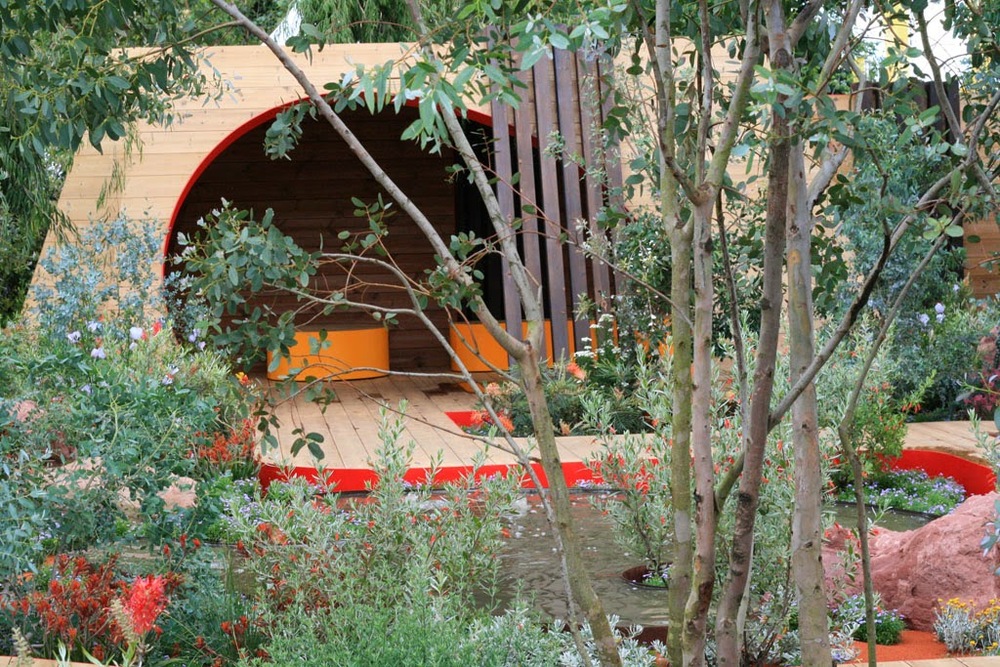
Essence of Australia Garden by Jim Fogarty was a knockout garden on the main drag. Forests of blue eucalyptus, grevillia and
Ozothamnus erupting from the red earth, bubbling billabongs, a serpentine deck and boulders evocative of a landscape quite different to the rolling hills of Kent that I’m used to. I was particularly keen on the dwarf kangaroo paw,
Anigozanthos (yellowish plant just above the deck in the second photo).
I respond well to a garden that provides an immersive experience, and if a show garden can draw you in while you're standing outside of it in the middle of a noisy crowd, then it’s definitely achieved this. I certainly felt this with the
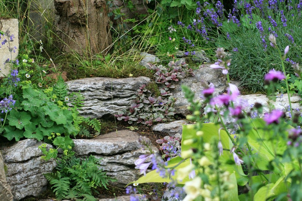
Forgotten Folly garden by Lynn Riches and Mark Lippiatt, a shady space where a dilapidated stone structure, stone walls and iron railings were being slowly reclaimed by nature, with foxgloves, scabious, a weeping birch and a young
Taxodium distichum, the swamp cypress. There was a shady, damp spot with ferns, a gunnera and white astilbes, and a touch I particularly liked was a little river of ajuga running down between stone blocks. I stood and gazed for some time.
I though that the
NSPCC Legacy Garden by Adam Woolcott and Jonathan Smith was very well realised, with some excellent detailing, historically accurate planting and touching props. But the whole journey-through-time concept doesn’t really work for me as a concept – I find it too self-conscious, yet at the same time constantly referring to something outside of itself which prevents you from being drawn into it. I suppose I want my gardens to be more installation than exhibit.
 |
| Transitioning from mid 20th century (left) to 70s (right) at this point |
Community gardening in its many guises is a growing phenomenon that's becoming increasingly hard to ignore, and it was good to see this celebrated in the
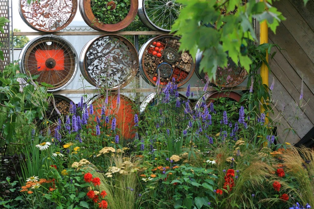
garden designed by Jeni Cairns and Sophie Antonelli, A Space to Connect and Grow. Here they have created a versatile space relying heavily on upcycled materials – industrial looking metalwork, a pergola made from scaffolding boards and poles, a sculptural feature constructed with sawn down oil drums and bicycle wheels, with artwork jostling side-by-side with insect hotels and planters. As well as fulfilling requirements for food production, wildlife conservation, and social gatherings, there’s a performance area too, which was being used to great effect with some very chilled out live music at the time I visited. The garden is an exciting example of what can be achieved through a collaborative project, in this case between the designers, the arts organisation
Metal, and the community growing group
The Green Backyard. I’m looking forward to seeing how the garden works for the community when it’s taken back home to Peterborough after the show.
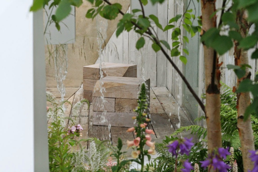
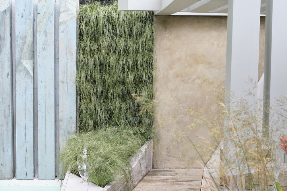
Alexandra Froggatt has created a serenely tranquil space with her
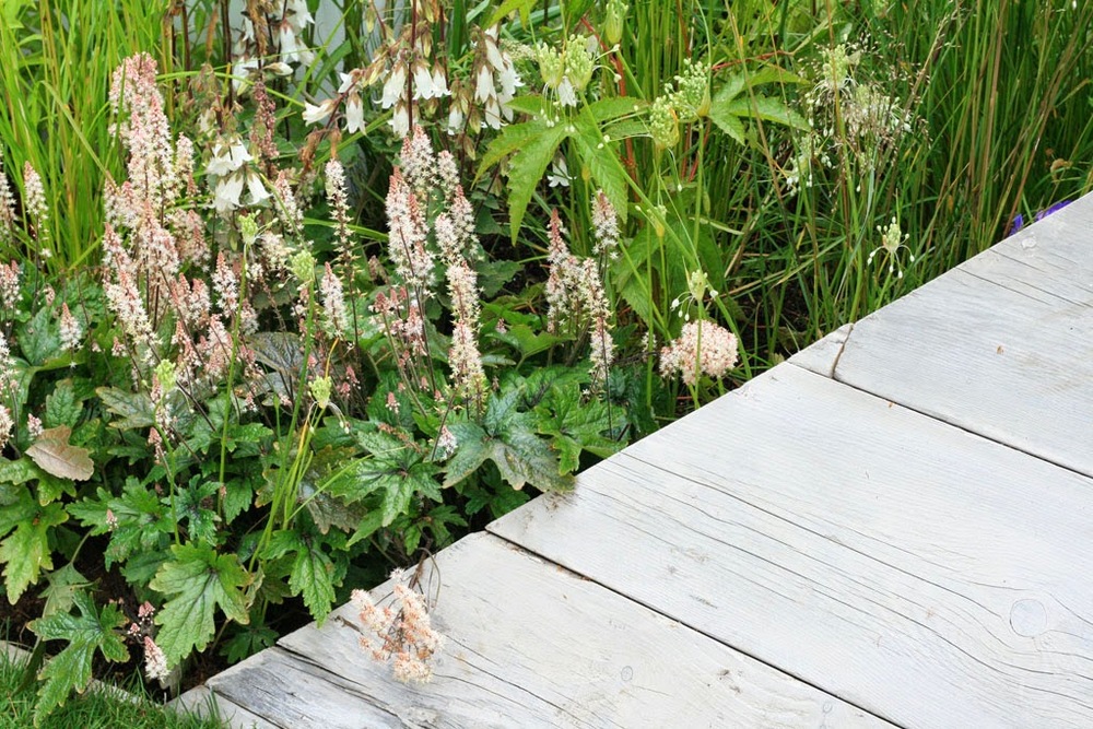
Garden of Solitude. Quite possibly this is the garden that will lodge most in my memory from this year’s show. It’s a white garden, but not in a Sissinghurst way. There’s a cool, harmonious blend between the limewashed shades of upcycled timber used for the hard landscaping (pergola, deck, walls as well as seating and sculptural elements) and the soft, grey greens of the woodland planting, with a wonderful textured wall of
Carex 'Frosted Curls'. The waterfall feature provided a strong ambient soundtrack at a perfect volume and intensity – loud enough to drown out the noises of the city, but still mellow and not so intrusive that you couldn’t hold a hushed conversation. In all an idyllic, peaceful retreat. I loved it.
How did I manage with my mission? True to form, I did get lost, and I did miss out at least two gardens. But not bad for three hours.


