 |
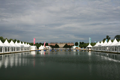
| They could at least have turned the fountains on for me |
I have been fortunate enough to have spent the past two days at Hampton Court, helping Fibrex Nurseries to set up in the Floral Marquee on Sunday (another gold winning display for them, hurrah!), and attending press day on Monday. 2015 is the twenty-fifth anniversary of the Show at Hampton Court. This is a truly stunning location, bisected by the the Long Water with its fountains, spanned by four pontoons, with the royal palace forming the focal point at the end. No matter how warm it gets – and, to my memory, Hampton Court is always hot and sunny (clearly I’ve blocked out the rainy years) – there’s always a cool breeze by the water, and a shady spot to sit beneath the lime trees which flank it in avenues on either bank, an ideal place to pause and to mull over the many things to see during the day.

This year the Show has been organised into three zones: Grow, Inspire and Feast (or respectively, Plants, Gardens, and Grub, if I was in charge of things. Fortunately for the RHS, I’m not). The first of these, the Grow zone, consists of the plant village, Floral Marquee and Plant Heritage areas, and here you’ll find wonderful plants, details of national collections and a wealth of expertise generously given from many of the best nurseries in the UK. You could easily spend your entire visit here, but just over the water the Inspire zone beckons, playing host to the show gardens and the trade stands, the Festival of Roses marquee and the Country Living pavilion. Further up the path from the smaller Summer Gardens you enter the Feast zone. Initially, I’ll admit I felt a little disgruntled. In the past this whole section has been given over to small gardens, so to discover that half of them had been replaced with cafes and restaurants could give the impression that the horticultural and design aspects of the show are being dumbed down in favour of commercial considerations. However, there’s more to Feast than eateries – the presence of the the Cookery Theatre and a full programme of talks from speakers including Alys Fowler, James Wong and Greg Wallace indicates that the RHS are looking to ramp up their evangelical efforts concerning the link between plot and plate, which can only be a good thing. On Monday, I narrowly missed a demonstration given to a group of schoolchildren by Raymond Blanc in the children’s community garden of Henri Le Worm (I would have loved to have attended, but couldn’t quite tear myself away from the plants in the Floral Marquee).
One final general note before I get on to specifics, which I record here largely for my own benefit in the hope that it might also be useful for someone else. Navigation is a big issue for me around the showground – on past visits I’ve lost my bearings and only discovered a huge section just before I was due to leave. It really helps to carry a map of the Show with you, but if you don’t fancy paying almost a fiver for the catalogue in which it appears (much of which is available for free on the RHS
’s excellent website), then use your phone to take a photo of one of the free-standing maps along the main route. Without a map, the rule of thumb is this – if you’ve not yet made your way over the water and to the opposite gate to the one by which you entered, you haven’t seen all there is to see. (Coming from the car park end via the Long Water Gate, the place where I would invariably get confused is a little choke point at the lower end of the Summer gardens, which takes you through an avenue of trees before opening out into an area leading down towards the conceptual gardens and the Thames Gate.)
Onto the gardens. There are over thirty in all over four categories, show, historical, conceptual and summer gardens. Here is a taste of those that made the biggest impact on me.
 |
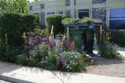
| Green roofed wheelie bins and permeable paving on the Community Street |
The
Community Street, designed by Nigel Dunnett, illustrates the current
RHS campaign, Greening Grey Britain, which is promoting the use of plants to enliven the hard, grey areas of our towns and cities, transforming unloved areas of harsh concrete and paving into healthy, productive and engaging spaces for the whole community. As housing density increases and our natural green space is eroded, this is a vital initiative if we’re to preserve our wellness and sanity in an increasingly crowded world, and I’ve been keen to see how the issues are addressed at the show.
 |
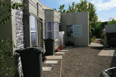
| All rather grey on the Community Street |
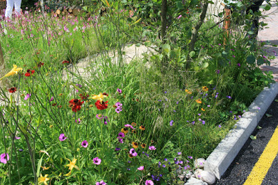
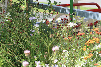
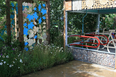
You enter the space through a recreation of a very grey, rather unloved street in Bristol, complete with abandoned car, litter and a fridge in one of the front gardens. Wall art depicts three of the main issues with our grey city space – rainwater runoff and consequent flooding, the urban heat island effect, and particulate pollution of the air. The garden goes on to demonstrate – with many information boards and an army of keen planty evangelists – how an informed use of horticulture coupled with appropriate hard landscaping can combat each of these problems.
 |
| Detail from the Community Street |
 |
| Detail from the Community Street |
 |
| Detail from the Community Street |
 |
| Detail from the Community Street |
 |
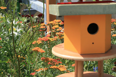
| Plenty of places for bugs and bees to set up home on the Community Street |
 |
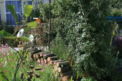
| Wildlife friendly hawthorn hedge and log piles on the Community Street |
The planting here was magnificently bold, dense and rich, and if Nigel Dunnett takes the props for coming up with the ideas, then great credit must also go to Kitty Wilkins and her army of volunteers for implementing the intricately detailed plans.
 |
| Detail from the Macmillan Legacy Garden by Ann-Marie Powell |
The
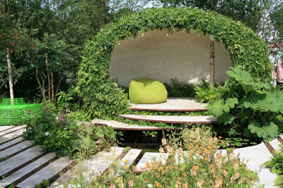
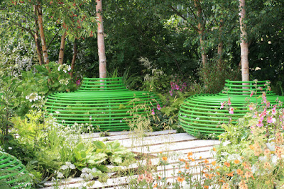
Macmillan Legacy Garden is the gentlest tour-de-force. Ann-Marie Powell has created a tranquil, edge-of-woodland space, lush foliage and white birch bark contributing to a soothing pallet of greens and whites – which just happen to be the sponsor's primary brand colours, also including copper/apricot tones from their secondary pallet in the planting, for example with the verbascums and the russet tones in the epimedium foliage.
 |
| Detail from the Macmillan Legacy Garden by Ann-Marie Powell |
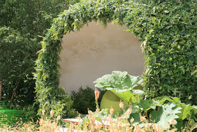
As a response to the turbulent and emotional journey followed by any family whose life has been touched by cancer, it’s a perfect place in which to seek sanctuary, to pick your way through the plants across the ribbons of water which weave through the paving, past the avenue of birches with their seating, and across the stepping stones to the seclusion offered by the softly rounded structure whose surface has been planted with ivies and ferns and other woodland plants.
 |
| Detail from the Macmillan Legacy Garden by Ann-Marie Powell |
 |
| Detail from the Macmillan Legacy Garden by Ann-Marie Powell |
A lush and slightly sinister note is introduced by the arisaemas, and perhaps even the gunnera has a slightly spikey, other-worldly feel which suggests elements of confusion and uncertainty. Maybe it’s easy to read too much into the individual choices of plants, but the overall effect manages to be at the same time soothing and stimulating. Just the kind of place I'd like to wander in, lost in thought.
 |
| Detail from the Hadlow College ‘Green Seam’ Garden by Stuart Charles Towner and Bethany Williams |
It was interesting to see my old college represented,
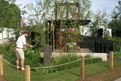
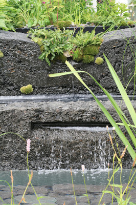
Hadlow’s ‘Green Seam’ garden, designed by Stuart Charles Towner and Bethany Williams winning Best in Show. This garden presents us with an allegory of how horticulture can play a part in improving the lives of those living in areas of social and economical deprivation, mirroring the work of the Hadlow Group with the Betteshanger Sustainable Parks initiative seeking to bring regeneration to the ex-mining community near Deal in east Kent. Big business and politics, rather than grassroots gardening, but it was encouraging to see the designers illustrate nature’s ability to reclaim post-industrial sites by depicting the colonisation of the old spoil heaps by pioneering wildflower species.
 |
| Detail from the Hadlow College ‘Green Seam’ Garden by Stuart Charles Towner and Bethany Williams |
 |
| Detail from the Hadlow College ‘Green Seam’ Garden by Stuart Charles Towner and Bethany Williams |
Another particularly accomplished effort was
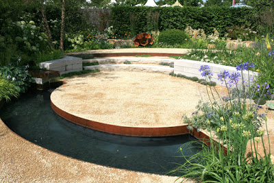
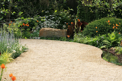
Vestra Wealth’s Encore – A Music Lover’s Garden, by Paul Martin. A sinuous path of consolidated hoggin between Corten steel edging winds through a landscape of sandstone rocks and lush planting, accompanied by a narrow rill, before descending into a small amphitheatre for musical performances surrounded by a curved pool.
 |
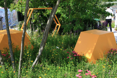
| Detail from Vestra Wealth’s Encore Garden by Paul Martin |
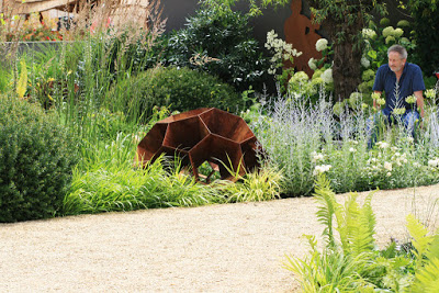
Some beautiful rusted steel sculptures nestle among the plants, their shape and form reminding me of pollen grains under the microscope.
 |
| Detail from Vestra Wealth’s Encore Garden by Paul Martin |
 |
| Detail from Vestra Wealth’s Encore Garden by Paul Martin |
 |
| Detail from Vestra Wealth’s Encore Garden by Paul Martin |
 |
| Detail from Vestra Wealth’s Encore Garden by Paul Martin |
 |
| Detail from Vestra Wealth’s Encore Garden by Paul Martin |
 |
| Detail from Vestra Wealth’s Encore Garden by Paul Martin |
The small space from
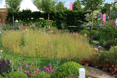
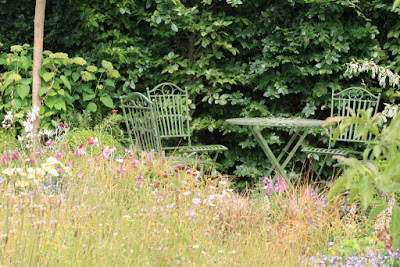
Squires Garden Centres – Urban Oasis by Mark Charles might not win great plaudits for originality of design, but I loved it.Neat boundary hedges, cottage garden borders, with the centre of the lawn given over to a wildflower meadow and bounded by a mown grass path, and a red brick path leading between twin seating areas to catch the morning and the evening sun, it represents a vision of what is achievable in a typical small domestic garden. A wonderful, wildlife-friendly space.
 |
| Detail from Squires Garden Centres – Urban Oasis by Mark Charles |
 |
| Detail from Squires Garden Centres – Urban Oasis by Mark Charles |
I would have liked to have seen more in the way of community gardens. Not to say there weren’t community spaces – there were some beautifully designed ones incorporating many a thoughtful idea but, as with Chris Beardshaw’s garden at Chelsea this year, they were posh, expensive ones, clearly designed by professional garden designers. While I’m aware that one of the reasons to come to an RHS show is to see how the professionals can push boundaries and use the latest, cutting edge techniques, materials and thinking, I can’t help but think that including more grassroots gardens, created from the ground-up by enthusiastic end users, would help to circumvent the uncomfortable feeling that these gardens are being bestowed upon grateful paupers by professionals, however well informed and intentioned (last year’s
A Space to Connect and Grow from Jeni Cairns and Sophie Antonelli was a great example of how to get this right). While I think this could be a valid criticism of spaces like the Community Street and the Vestra Wealth garden, it’s less applicable to the Macmillan Legacy Garden which, while being conceived partly as a communal space and undeniably high end, is not designed as a living space, but more of a therapeutic space rather like the gardens of the Maggie’s Centres.
In past years, there’s been a definite feeling that people without pots of money to throw at the garden were being catered for. I wonder if that might have been lost a bit this year. It would also be good to see more on elegantly practical solutions to the kind of real-world problems that the garden and home can throw up, as with Mike Harvey’s
A Room with a View from 2013’s Show, which built a wonderfully terraced garden on the spoil heap of soil excavated for the foundations of a typical home extension.
These small criticisms aside, it was good to see that the Conceptual gardens section is as bonkers as ever. It might not be everyone's cup of tea – not everything here is always my cup of tea, to be honest – but it’s good to see some interesting ideas being explored. I’ve always been fascinated by the concept of synaesthesia, ever since hearing in a university lecture how the composer Oliver Messiaen, who experienced the condition, once demanded that the violins should play a particular section of his score “a little more pink”. So it was fantastic to experience the
DialAFlight: Synaesthesia Garden by Sarah Wilson, which presents a heady mix of sensory stimulation with a creative combination of coloured lights, projected trigger words, sculpture and planting, inside a white canvass dome representing the mind of the synaesthete. Sadly I was enjoying myself so much I neglected to take any decent photos (please do let me know if you have any and I’ll feature one or two here, with appropriate credits, of course!).
Another garden I found particularly powerful in this section was Steve Smith’s
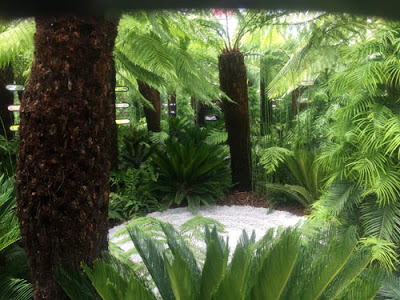
SMART Vision garden, which portrays the attitudes of society to those suffering from mental health issues by enclosing the entire space in an austere, grey wall, wrapped in yellow and black hazard tape. Through peepholes in the wall you glimpse a tranquil space inside, a white, zen like circle of raked gravel surrounded by lush tree ferns and foliage plants, prehistoric flora that shows the resilience of nature left to its own devices. The inner walls are mirrored, so the space inside appears vast, and a strange feeling of fellowship succeeded the initial shock of discovering that you weren't the only person peering in on spying many other inquiring eyes among the plants.
 |
| Detail from Steve Smith’s SMART Vision Garden |
 |
| Detail from Steve Smith’s SMART Vision Garden |
Please click here to read the next part of my blog on RHS Hampton Court Flower Show 2015.
